
Can I just say that any holiday that uses an overwhelming amount of saturated reds and pinks in it’s celebration is OK by me?
As I was going through my Valentine inspiration files this year I couldn’t help but be overwhelmed by the powerful, strong colors popping off the pages. I was inspired…and the artist in me just want to dip my brush in and explore the variation and intensity of the wonderful hues.
So for this years Valentines cards, that is just what Little A and I did. We jumped right into a little “Color Theory 101”, and ran with it.

I started us out by going through my acrylic craft paints, choosing a variation of beautiful reds (wine, cranberry, tomato, blood, etc.) and then threw in orange to warm things up and white to push us a little into the pink zone.
I then drew out a grid for us to place the various, scrumptious hues.
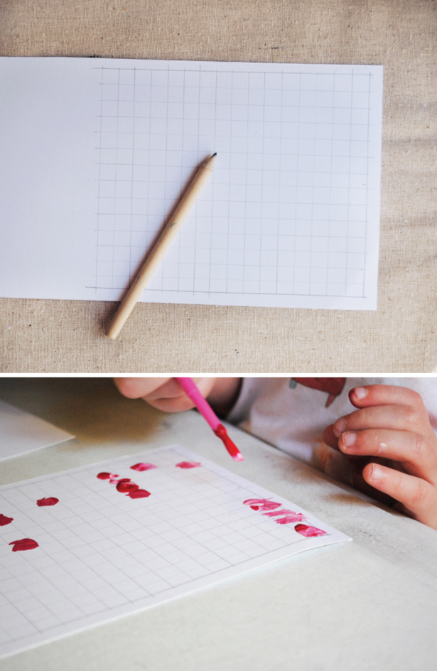
Little A got right to work. He was very interested in blending colors so we got to the pinks right away. From there I had him mostly work with one color at a time, blending here and there with other colors if he chose to. I was sure to point out the amazing, subtle variations that one hue, RED, could have. I also worked right alongside him, helping him fill in random squares throughout the grid.

He got really into it…taking things pretty seriously (as you can see here).

In no time at all, the entire grid was filled with delicious, eye popping colors.

It really was a little mini work of art. In fact, I almost hated the idea of cutting this up into little Valentines…I almost wanted to frame it and hang it on the wall!

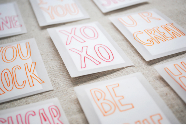
Well cut away we did (but not until I scanned it in), creating little mini custom works of art for each of his classmates and teachers.

We then addressed the cards and fit them into business card size vellum envelopes (that I’ve had hanging around, and dying to use, for forever).

Of course no Valentine would be complete without a little candy, so we placed a decadent dove chocolate cherry swirl heart in each one (and can I just say yummy!).

I then added little conversation heart sayings to the front of each envelope using some of my favorite pens (these seriously come in SO handy. I’m addicted…and you will be too).

Little A and I had a wonderful afternoon creating these. In fact he’s asked me a couple times since if we could make more valentines…
and hey…I’m all for spreading the love around…
…so much so that we have created a downloadable pdf version here for you to use if you don’t have time to make one of your own. Just click here to get started.
(And if you are looking for more V-day fixes this year, check out our piratey Valentines downloads from last year (recently featured on Parent Map and Crafty Crow). They were a big hit with Little A’s mateys!).
** All downloads are for personal use only. Please do not use for resale, or commercial production.
This is brilliant! I’m going to try that with my girls this week, even though the one still handing out Valentines already has hers done.
These are so great, must try to make these with my girls too sometimes! (we are big fan of those pens too 😉
Wow! Those are beautiful. I love the little pops of orange.
these are beautiful!!
Great cards – they’ll sure be a sensation!
fabulous! i need to buy some paints to try that out 🙂 also, I printed the template but it came out a little blurry. thanks!
Those are the cutest valentines!!! I’m now craving some dove chocolates though 🙂
sorry Molly, try the new pdf link in the post. These should come out nice and clear.
thanks!
Amazing! Great project.
lalalalove!
adorable, as always.
love this idea! would love to try it out on a larger canvas for some cheap wall art.
I just discovered your blog, so glad I did! These Valentines are gorgeous…I’m sharing this post on Twitter 🙂
Cristina @Positively Beauty
Hey he can always send love on over to his cousins!
So adorable you are so ahead of the game with these!
this is seriously too cute! thanks for sharing
These are beautiful!! 🙂
I liked… kiss
beautiful, tks! (:
wow, so creative! i love these;)
Wow…so beautiful!
wonderfully inspiring. thanks for the great post and fun idea. i can’t wait to get out my paint box!
so so cute, mer. when are you going to start posting more often??? 🙂
i just discovered your blog and i have to tell you…this is so great! the colors are so beautiful, it makes me feel like breaking out the paints again. 🙂
Wow! I love it. I’ve reposted it on my blog with credit to you!
Thanks for sharing,
http://www.brittanyhavican.blogspot.com
Brilliant!!! I will be doing this with my girl this week. 🙂 Thank you for the inspiration.
Brilliant!!! I will be doing this with my girl this week. 🙂 Thank you for the inspiration.
Simple yet sooooooo effective, partnered with the velum envelopes- very trendy.
lovely idea and I love those pouty lips concentrating on getting those squares painted very cute. They look very Eric Carle ‘Hungry Caterpillar’ looking.
just saw this over on black eiffel…such a great project…and i agree, those are my favourite pens!
So cute! Just wondering where you got the envelopes?
really, really, love it!
This is such a gorgeous idea!
These are beautiful. An awesome idea.
Beautiful! I love it.
Absoultely scrumptious! Going to have to give this a whirl with my little one.
Love this idea! Looks like Little A enjoyed it too! What a great way to get back to how it used to be….homemade Valentine’s Day cards. Fabulous!
Hi Tanya and Colin, you can get the vellum envelopes here: http://www.envelopes.com/business/regular/3-mini-envelopes-clear-translucent
thanks for asking.
Mer
Lovely lovely idea for Valentines or any time cards! Promptly making some this evening. Thanks for the inspiration.
these are so awesome 🙂
I’m doing it with my kids tonight. Thank you!
These are absolutely gorgeous! I saw a link to these over at Silly Eagle Books and am so glad I clicked through. I can’t wait to try these with my daughter, good thing we have a few days left until the big day!
Oh how lovely! I can’t wait to do this- but I’m going to put it on my wall. =) Thanks tons- you rock! Ohh and I’ll be linking as well.
found you via pinterest. beautiful color study & pretty striped curtains.
Love this idea. I was looking for some artwork to put in our kids bathroom walls when I came across this little number. We (my three kids) did it on canvas boards, it looks fantastic. Thanks for the wonderful idea.
UH!!!!!! these are just insane awesomeness! I’m totally with you on the stong colour front… reds are fab.
thea.
xx
(spoonfulzine)
what a fun idea! Those colors are fantastic.
this would make an awesome fabric design! let me know if you ever create some custom fabric with it!
This is a brilliant idea. I can’t wait to try it with my 4 year old daughter.
Amy
http://whatfeedsmysoul-aha.blogspot.com/
Another beautiful project! And I agree with Leslie, it would do great for a fabric and products…
Awesome idea…spotted it thanks to http://allthingsami.com/. Love your site!